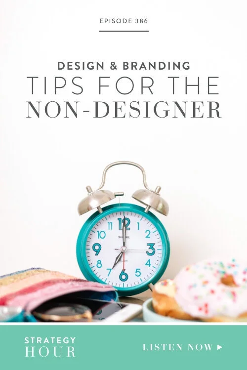
Design & Branding Tips for the Non-Designer
Episode 386: Show Notes
In the creative entrepreneur world, there are so many talents and you guys are doing great! But the one thing we’re seeing, and we’ve done the same thing, is that design work sometimes falls a little short. You might be a photographer, fine artist or wedding planner but do not necessarily have the expertise when it comes to your branding — that’s a set of skills entirely on its own. It could be an email header, a social media announcement or an infographic you need to whip up, and it’s not as easy as it looks. Graphic designers are trained to know what works and have a sharp eye to identify off-balance designs, but we regular folk don’t have that same skill.
Listen on your favorite podcast player


So, today Emylee gets to direct questions at Abagail who, as you all know, is a kick-ass designer. Wearing her designer hat, she will advise you about representing your brand in the most professional manner even though you lack professional skills. As much as we focus on teaching you guys about increasing profit, the way you show your brand to the world can be a make or break aspect. The bottom line is this: when you use the same styles, colors and fonts consistently, you become recognized as a brand, and that is your goal.
Initial Pain Points For Emylee and The Cornerstones of Design
While Abagail deals with all the design elements for Boss Project, Emylee has two other side hustles in which Abagail is not involved. In other words, Emylee still goes through many of the design struggles you guys do! Years ago, when she was still blogging a lot, she wanted to create a cohesive feel for her blog post graphics, knowing that she wanted to share them. She used Canva to design a blog graphic template but then would keep redoing them, not feeling happy with how they looked a few days later. She would keep redoing them again and again and this only results in frustration. The layout is really important – just think about putting together a room or wall. That being said, there are pieces you will need in all circumstances, that are universally applicable, depending on the “canvas” you work on. For graphic design, then, there are also certain cornerstone principles. Cohesiveness, for example, is crucial when you are trying to build a professional brand. While experimenting is fun, it is best not to experiment when it comes to your designs because it prevents you from becoming recognizable — which is the whole purpose of branding. But how do you build cohesiveness when you’re not a professional designer?
Choosing the Right Display and Body Copy Font
You might have a custom logo, and so you want fonts that complement your logo. If your logo is not custom and you’re just using a font, you can choose whether you want your font to be part of your overall brand or unique to your logo. Either way, you will want to come away with one special font – we call it display font. It doesn’t have to be crazy. You’ll use this font for headings, but not for everything; it needs to remain special. If your logo is a script font, decide that it’s going to be unique to your logo. Don’t use a font that is difficult to read for any other area. Readability is crucial, so if it’s only cute, use it sparingly. Serif fonts work well because they’re simple. In addition to your display font, you want one body copy font, and they usually come as a family, which provides you with different variations of the same font. Body copy font should be easy to read – not too light or too thin. Think about your audience here; you want to make it accessible to everyone. Then stick with these two fonts; don’t go introducing some random fonts when you’re feeling creative.
Deciding On A Color Palette
If you can’t find a color palette, all you need to do is go on Pinterest and search “color palette”, with adjectives such as “earthy”, “bright”, “blue”, etc. This is so convenient because the color design is already done for you – you don’t have to give it another thought. Ultimately, you are going to need the hex codes for these palettes, which is basically what these colors translate into online. Here’s a hack: download ColorPick Eyedropper for Chrome plugin, and even if the website doesn’t share the hex codes, you can click the Eyedropper, hover over a color and it will give you the code. You can also search Adobe Color which allows you to identify colors from an image. We suggest choosing three colors and adding a few neutrals to complement. You might sometimes want to add grey, black or white to the pallet, but make sure you choose the right shade and stick with it. Put your colors and codes somewhere where you can easily reference them.
Advice For Maintaining Cohesiveness and Looking Professional
Look for kits or collections that all match and go together, such as places that offer social media, website, and collateral you can use for your clients. Before you even find this one-stop perfect solution, be sure to look out for those elements that don’t fit into the whole and get rid of them. If you have a bunch of mismatching fonts, styles, and colors, your brand just looks slapped together. Even if you don’t have a designer, photography can take you far. You can have an average or poor website or template, but with the aid of amazing photography, you can bump it up ten notches. When you think about where to get the photography from, it depends on what kind of company you have. If you have custom-made products, you need professional photos of those, but if you’re a health coach, you can find free or paid stock images that look amazing. You can also mix stock photos with the photographs you have taken professionally. When it comes to photography, you’ve got to ensure the editing style is cohesive. For example, if your look is dark and moody, that’s what you’ve got to stick to. Stock photos are much more available these days, so be sure not to use photos others have already used. Some great free sites include unsplash.com and pexels.com. A good stock website allows you to get very specific in your search.
Recognition Recognition Recognition!
We’ve said it before, but we’ll say it again: your goal is to have your brand recognized. When people are scrolling through their Pinterest feed, you want them to start spotting your brand among the many others because you’ve made your brand mark and have consistently conveyed the same look and feel. Inside the consumer’s mind, this recognition happens subconsciously. And when people start loving your brand it’s not so much about it being the prettiest or trendiest, but because it becomes familiar to them – and we all gravitate towards the known and familiar. It makes us feel safe. Being repetitive and predictable makes you seem reliable. This is because it makes you come off as grounded and consistent, which makes people trust you with their money. Consider how shocking it is when big brands change their branding. You always question it for a second. Think of Facebook’s changes; they didn’t redo the whole thing but slowly and systematically applied small changes while still keeping key elements consistent. These brands are very careful not to disrupt the trust they’ve built with people over many years.
Closing Thoughts On Changing Direction
We’re not saying that you shouldn’t evolve. By all means, do! But when you decide to shift gears, you’ve got to stick with it for at least six months. Make sure whatever you pick aligns with who you are. When we’re building a business, we’re inevitably attracting people by who we are. While we might think it’s not about us, it really is. People want to relate to those they do business with; they want a sense of shared values and so they buy a relationship with you. Therefore, you have to show up as yourself in your brand. When your branding clashes with how people see and experience you, then that will break down trust too. So, picking the appropriate branding should be easy, because you should pick the things you like and that resonate with you. Don’t try to be someone you’re not.
Quote This
The cohesive part is crucial when you’re trying to build a professional brand.
Highlights
Initial Pain Points For Emylee and The Cornerstones of Design. [0:05:03.1]
Choosing the Right Display and Body Copy Font. [0:09:43.1]
Deciding On A Color Palette. [0:14:50.1]
Advice For Maintaining Cohesiveness and Looking Professional. [0:21:04.1]
Recognition Recognition Recognition! [0:33:23.1]
Closing Thoughts On Changing Direction. [0:42:28.1]
ON TODAY’S SHOW
Abagail & Emylee
The Strategy Hour Podcast
We help overwhelmed and creative entrepreneurs break down their Oprah-sized dreams to create a functioning command center to tame the chaos of their business. Basically, we think you’re totally bomb diggity, we’re about to uplevel the shiz out of your business.
KEY TOPICS
Branding, Graphic design, Fonts, Color palettes, Consistency, Brand recognition