How to Create An Inspiration Mood Board
At the beginning of every branding design project I find myself creating an inspiration mood board. This used to be something I used exclusively for my own purposes to guide and inspire a new brand I was about to embark on. I discovered, however, how useful it is to get clients involved in this process. Not only does it get you excited and give you a sneak peak of where the brand is going, but it allows for both the client and I to be on the same page.
Many clients will start a conversation about what they want their brand to look like by using generic adjectives like – modern, clean, traditional, bright, quirky, etc. Although this process helps, my version of quirky is not always their version.
From the inspiration mood board we can start to build a visual identity for the brand. This not only defines style, but also the color palette. By agreeing on this in advance, we have a much clearer path for how to get to the end result.
I wanted to give you the inside scoop of what this actually looks like, and what it could potentially mean for you and your brand. Whether you are still in start-up mode or an established company, this process clearly defines the road we will go down.
Create a Group Pinterest Board
Pinterest has long been my favorite way to go about this process. Not only are there thousands of amazing images already in Pinterest, but you can pin inspiration from anywhere online or upload your own images.
Before I start a branding project I create a secret Pinterest board and invite my client to it. I ask them to reflect on the color, style, theme, and feeling of the brand they want to create. I also request they write a brief description as to what attracted them to a particular image. The description comes in handy later so that I have a better understanding of what about an image they liked. There can never be too many images. The more the merrier. I, of course, can’t help myself and often pin images I also feel are a good fit. Sometimes people will get caught up on what to pin. Don’t worry about it, just go with your gut, that is what the next step is for anyway.
After we both have had sufficient time to pin, we will have a conversation and cull the board. The culling can be difficult, but by taking images away that stick out like sore thumbs we build a stronger more cohesive message.
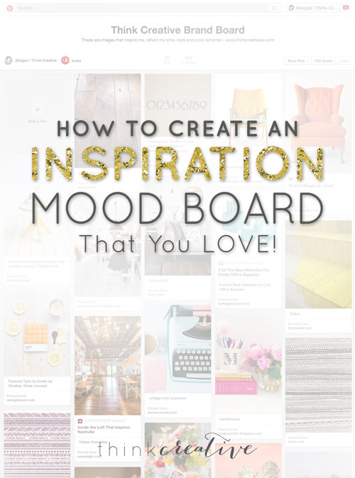
Note: As an example I created my own brand board to give you a taste of the kinds of things I think relate to my company and my brand. Feel free to check it out.
Find the Common Thread
Once we have had a conversation and discussed the direction I will go through and pull out the common images. What similarities am I seeing? Do they all have a similar natural color palette? What sort of textures do they have? Do they effectively relate to the feeling my client wants to create, while also being the right fit for their audience?
As you can see in the Pinterest board (my own brand mood board) above I have pinned images that are bright and vibrant. The style is a bit eclectic, but still has a mid-century modern flair.
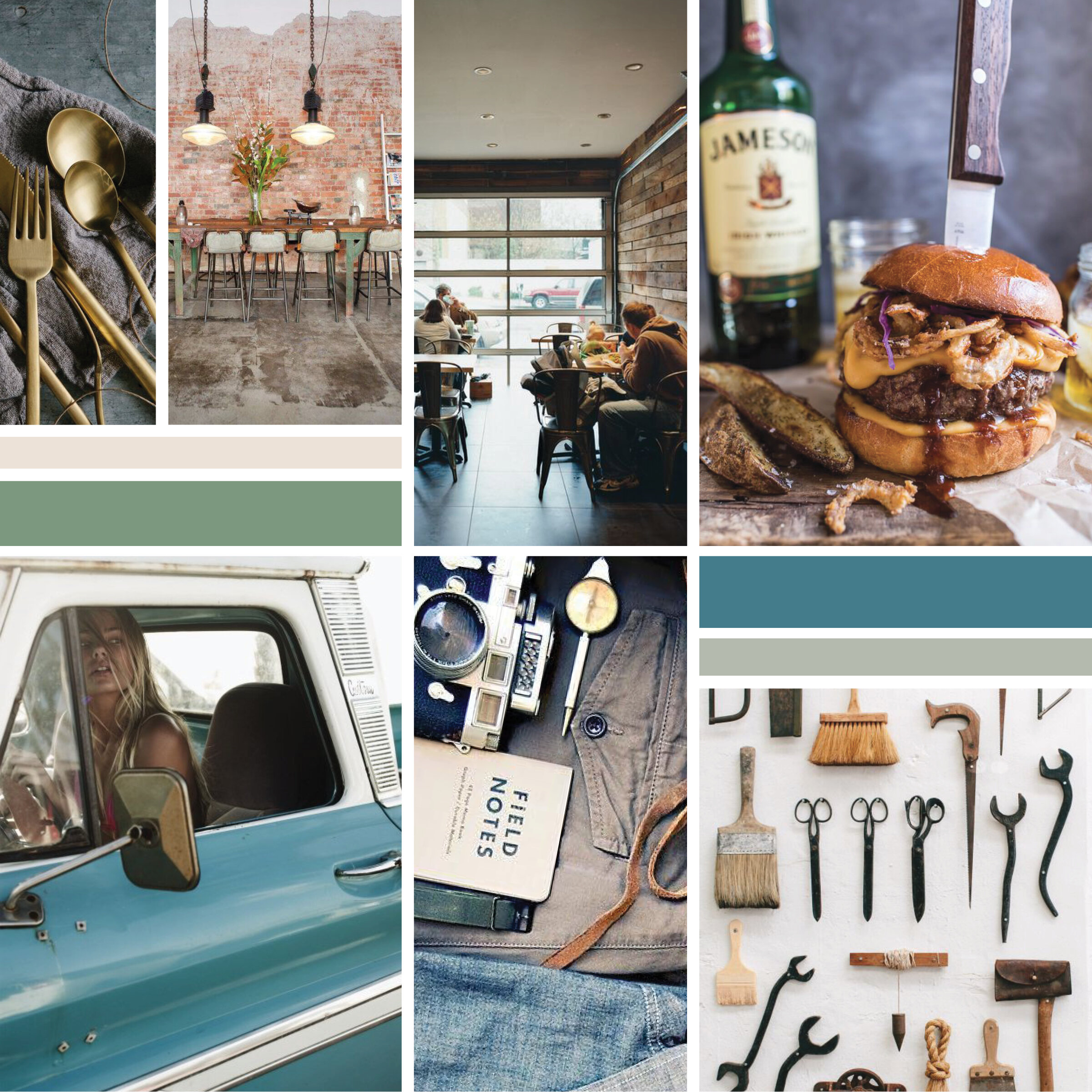
The photos on this board are for one of my current, super-secret clients. They all have a masculine with a rustic vibe. The colors are subtle and there are lots of neutrals and rich earth tones.
This collection of images is much more feminine and has a common theme of whites, creams and barely there colors of pink and mint. There is a sense of softness, while still having rich texture and flow.
As you can begin to see the above boards really take on a life of their own. They each create a distinct style and quickly define themselves as unique brands. By determining the common elements in each board I can create a cohesive final inspiration mood board.
Note: As much as possible, I try to have my images relate to the industry or type of business that client owns. However sometimes, you may just need to use an image that's not directly related to the industry to capture a color or texture that you might otherwise miss or better visualize a buzz word.
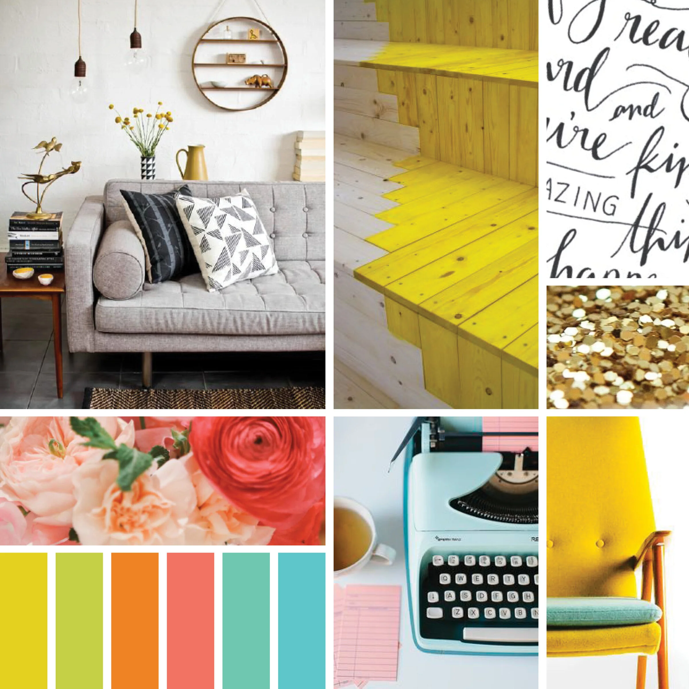
Here is a sneak peEk of what Think Creative clients will receive
as their final Inspiration Mood Board.
This is actually the board I created to start to better define Think Creative's current brand image.
This amazing brand will launch late Summer 2015. Stay tuned!!
Fun, flirty and feminine. It's so sweet you can almost taste the sugar.
Final Board Layout
Once I have defined the similarities between the images I will pull out the strongest images and save them to a client’s folder. I will then use Adobe InDesign to layout the document (Photoshop or Illustrator will also work as well). Within the layout I try to balance the images as much as possible, not only in scale, but color, depth, importance, etc. This can be pretty time consuming, however the end result makes it worth the effort.
A couple of things to keep in mind:
Use 7-10 images per board – vary not only the size of the image, but the scale of the object photographed. For example an Elephant from 100 yards away looks significantly different than a close up of an Elephants back. Use several images that are closer in perspective and several that have more depth to them.
Make 2-3 images the focal point. You want your eye to be drawn around the board. If all the images are the same size, your not going to know where to look first.
Small margins between images give the eye a visual break and help pull together the images as if they were all pieces of a puzzle.
I always pull out 2-6 colors using the eyedropper tool and include them on the board. Yes, in my opinion glitter can be a color, but that might mean 6 colors + bonus sparkles!
Using the Inspiration Mood Board
After I have built the final layout I share it with the client and make sure they are happy with the result. This board will from there on out serve as a guidebook for how to build the brand, style, colors and tone. If I get stuck somewhere along the design process I can refer back to the board for inspiration.
Have you used an inspiration board before? How have you created them? How do you find them useful?


