New Brand + Website Design for Summit Grove Community of Christ
While I have showcased many of my designs on the blog, I have never shared a website launch with you. Today marks a pretty exciting day and I am so glad you get to be a part of it.
I believe in a collaborative design process where we work together to develop a strategy and concept that is the perfect fit for your business or organization. I have walked you through this in a 3 part series, but never revealed final designs that would come out of this process. If you missed that series, I suggest starting here:
My Design Process: Part 1 – Lattes & Laughter
My Design Process: Part 2 – Think Creative
My Design Process: Part 3 – Design Works
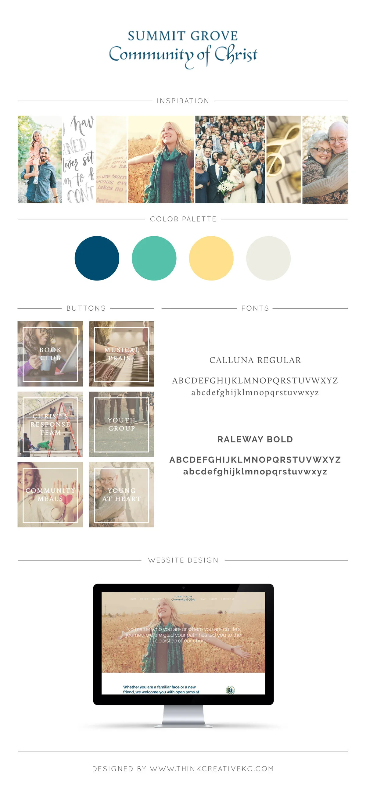
I am giving you a little behind the scenes look at the creative process that took place in my latest design project for Summit Grove Community of Christ. The cheerful color palette, warm photographs and inviting tone are a true reflection of the congregation that is a few short miles from my home here in Independence, MO.
1. Creative Brief & Inspiration Mood Board
I start every project with a Creative Brief to not only clearly define the expectations of the client, but also reveal the personality, goals and unique characteristics of the brand we are about to create or improve upon.
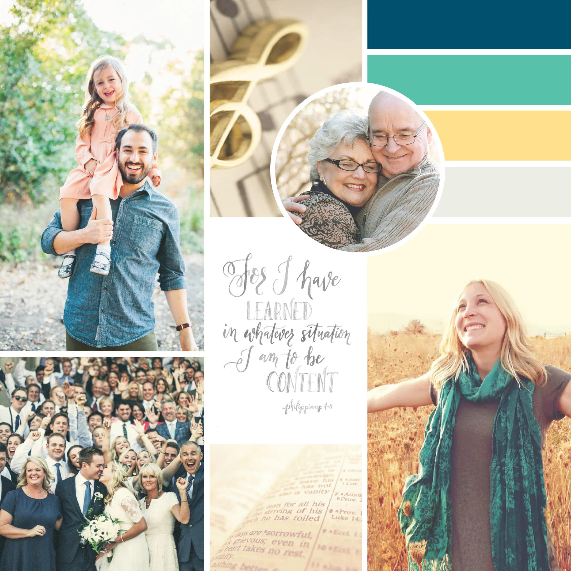
For most design projects, I immediately move into developing an Inspiration Mood Board. Here we define the overall aesthetics and visual dictionary as a basis for making all future decisions.
In the case of Summit Grove, Marlo Brush, described the brand they sought to create as inclusive, welcoming, warm and sincere. She did a great job pulling together goals, objectives, ideal audience characteristics and background of the congregation that I personally would not have been privy to.
It was a bit of a unique situation, as we couldn’t completely come up with something new as they are governed by a higher organization with very strict brand guidelines. Things like color and font choices were limited, however, that did not mean we couldn’t highlight the unique features of their community.
When I pulled together the inspiration board I began to develop a color scheme. I chose to keep it modern, yet traditional, light-hearted, yet inspirational. Warm yellows and a variety of blues emerged with hints of creams to keep it neutral. The yellows evoke joy and represent hope for the church. The teal blue represents community and a coming together of ideas and multi-generations.
I wanted the images to showcase the feeling of the church when you actually meet with the parishioners. I carefully curated the photographs to represent the various stages of life a couple may go through in their time at Summit Grove, as this community is perfect for both the young, old and anywhere in between.
2. Logo Concepts
The next step in the process uses the initially defined vision to create a variety of logo options. In this case, since the larger church controls the brand, we didn’t have any decisions on logo concepts. However, we used the queues from the aesthetics of the existing brand to continue to affect the look and feel moving forward.
3. Content Creation
If you haven’t noticed, I am a firm believer in the power of the written word. In many of my design projects I help the client develop new content providing a framework for which the design will follow. This can include anything from navigation down to every bullet point on the page. I find this to be a huge opportunity to further uncover the necessary pieces to tell the clearest story.
4. Website Design
All the pieces and parts always seem to come together when I reveal the initial look at the new website design to the client. Many of them are shocked by this first look and are able to better understand how all the pieces we've worked together on are finally coming together.
One of my favorite things to do, specifically for brands that are pre-existing, is show them the difference between the before and after.
What do you think?
Before
After
I am so excited about how Summit Grove Community of Christ’s Website came together. I truly believe it showcases the church's strong community and diverse congregation.
Marlo Brush and Carmen DeHart deserve a huge round of applause for all their hard work and preparation for this project. Their attention to detail, prompt feedback and organization insured every aspect of this project is a success. I am excited to be continuing to work on further projects with them including several collateral items.
If you haven’t already, be sure to head over to their new website to see how it all came together.
I would love to help you uncover the true potential of your church, non-profit, small business or other organization. I have many design and marketing services custom tailored just for you. Find out more about how we can work together.


