8 Steps You Can't Miss When Growing Your Instagram Account
Some of us have been riding the Instagram wagon since it first launched in 2010. Even then, using Instagram for business is a whole new ballgame, and even more so for those who have never even used it.
You might be used to using Instagram as a super casual “here’s my latest latte art” kinda spot. But as soon as we get intentional about using it for business it’s a whole new ballgame.
And more often than not you’ll let a lot of anxiety creep in as soon as you stop using Instagram just for personal use. Where do I put these selfies? How do I sell on here? Oh my god, I haven’t posted in weeks!
So let’s break it all down for ya. Plus, we’ve got a really cool tool for you to use to make your feed extra beautiful at the end.
1. Don’t Take Your Bio for Granted
Your bio is the first thing visitors check out when coming to your profile, right?
Often times, people will fill this out in a rush. They’ll think of a couple of lines that they feel explains their business well, and they leave it at that.
The truth is, your Instagram bio is just as important as what you post. This is what will give followers (read: potential customers or clients) their very first impression of you or your brand, and it immediately gives you the opportunity to direct their attention to something else, even if they don’t stick around long enough to scroll through your feed. Aim to fill out every part of your bio.
LET’S START WITH YOUR USERNAME AND PROFILE PHOTO
The first thing to try is to use your business name as your username. If the whole username is taken, you can then try to shorten it down. You want to at least have some portion of your business name included in your username, but if that’s impossible for some reason, people should still be able to find you by your bio’s “Name” field being your business name.
On that same note, if you’re a service-based business whose business name is the same as your first and last name or some variation of it, you’ll also want to include that title alongside your name in your bio. Having “Jane Doe - Virtual Assistant” instead of just “Jane Doe” will increase your chances of popping up in someone’s search list if they type in “virtual assistant”.
Your profile picture should be something that’s easily recognizable. Your simple logo is the most popular go-to, especially for product-based businesses, but if you’re the face of your business, you can use a professional headshot of yourself.
COPY AND CALL-TO-ACTIONS
You have 150 characters to make sure your visitors are seeing what they need to see, so you want to keep it simple and straight to the point. Give visitors a clear idea of what you do, but you don’t have to go into your background, where you grew up, what your favorite drink from Starbucks is, etc. Try to keep that part as short as possible, and use the rest of your characters to create a CTA (call-to-action) or two.
Of course, the main CTA is what you decide to include in your link portion. This could be your website, Linktree, landing page, event sign-up page, etc. The last line of your bio could be something like “Click the link below to browse our Black Friday sale” with a fun emoji pointing down. Emojis are always a good idea to add personality and visual appeal to your bio and to direct eyes to what you really want them to see.
Another CTA– and this is perfect for physical or digital product-based businesses– is to encourage people to either tag your username in their pics of your products or to tag your brand’s hashtag. Now, you don’t have to stress your brand thinking of a cute and clever hashtag to use. If your business name is Jane Doe Creations, your hashtag could simply also be #janedoecreations.
Hashtags and usernames are clickable in Instagram bios, so simply saying “Tag us in your pics #hashtag” not only encourages people to use that hashtag and possibly get featured on your page, but visitors can also click them to see other photos that have used it. This could be more of your posts, or they can see pictures others have taken with your product. The same goes for if you have sister accounts; tagging their username will allow others to click on it and go to that profile as well.
BUTTONS GIVE YOU THAT EXTRA OOMPH
Instagram gives you a variety of options to use for the buttons in your bio. You can have a button for visitors to call, email, book, get directions, get tickets to an event, or make a reservation at a restaurant. Having a form of contact can be so great for visitors who may have a question about your products, or so that potential clients can reach out to your service-based business (and don’t even get us started on the “Book” button… SO GOOD).
2. Show Up in Your Stories Regularly
You’d be surprised how many people love going through Instagram stories. They’re a great way to get featured in hashtag searches, connecting with your audience, engaging, and even more CTAs.
Posting stories regularly increases the chances that people will view them, thus also increasing the chances that you show up towards the beginning on their Stories list, making it even easier for your Stories to be seen. People also have a habit of viewing Stories when visiting a new profile.
Things that you might not want to post on your feed, you can post in your Stories instead. They also give you the perfect chance to connect with your followers.
INCREASE STORY ENGAGEMENT
Instagram has a handful of stickers you can use in your Stories to encourage engagement from your followers, such as the questions sticker, polls, chat, quiz, slide bar, and countdown. All can be such a great way to interact with your audience.
You don’t even have to conjure a clever business-related way to use the stickers. Simply posting a photo of two outfits and having a polls sticker to ask your audience which outfit you should wear for your photoshoot will suffice. If anything, it may even perform better because it doesn’t take a lot of thought to answer, it gives them a little BTS peek, and it will make them want to stick around to see which outfit wins.
Stories don’t have to be cleverly thought of, but making sure you’re showing up in some way or another at least every day will do so much good for your account. Posting updates about your latest blog post, podcast, event, webinar, etc, is perfect to gain more traffic to those things. If you have 10k followers or more, you can add the “swipe up” feature to your Stories and add a link. If you don’t, it’s not the end of the world. You can still encourage them to go visit in other ways.
P.S. If you want to make your stories extra sexy, check out these templates in our shop!
3. Add Story Highlights to Your Profile
Instagram has a feature called “Story Highlights” where you can choose Stories you’ve posted in the past and create different “albums”, which will then show on your profile right under your bio.
These are awesome for letting people get an organized look at your Stories. If you’ve had 18 story posts showing BTS on how your products are made, it would be a great idea to create a Story Highlight dedicated to those stories.
Take aspects of your business and think of highlight ideas that you could use. Some universal ideas could be reviews/testimonials, a day in the life, music that you like, quotes, books that you’ve read, or a “fun” category just to show a more personal view of you. If you have a podcast, create a podcast Highlight– same with a blog, workshop, speaking events, media appearances, etc. You get the idea.
CREATE ON-BRAND AND COHESIVE COVERS
You’ve probably seen on many accounts where their Highlights may just be a small icon against a color background– one of their brand colors. You don’t need an elaborate cover just for a small icon, but you do want the colors to match your theme and branding. It’ll help make your profile more aesthetically pleasing to the eye.
It takes two seconds to pop into Canva and create a cover for your Story Highlights, and there are tons of short tutorials on YouTube showing you how to put together a quick cover, even by just using free apps on your phone.
4. Utilize Hashtags in Your Posts
When someone searches for a hashtag on Instagram, posts appear that have used that hashtag. So, it’s obvious why you’d want to use them in your posts, too!
Search around for hashtags that are related to your niche. Instagram will also show you how many posts have used that hashtag. Now, it may seem like super popular hashtags that have 1M+ posts under them are what you should be using, but it’s quite the opposite.
The more posts under a hashtag, the more likely yours is to be buried under that sea of posts, never to see the light of day. You want to use ones that have around 100k posts, 300k being the maximum. This shows that people do use the hashtag, which means it’s probably searched for often, but you’ll have a much better chance of your posts being seen.
Also, be mindful to be using hashtags that your customers and clients would search, not your competition. Otherwise, your grams will be popping up in a hashtag feed of other people in your industry.
HASHTAGS WORK IN STORIES, TOO!
Did you know that using the hashtag sticker in your Story has the same effect as adding them to your feed posts?
Hashtag search feeds also have Stories, and anyone that has a public profile and has used that hashtag in their Story will be added to it. This is also why it’s a good idea to use hashtags with less posts under them because it decreases the chances of someone having to tap through a thousand Stories just to see yours.
Alongside the hashtag effect, the same goes for adding locations to your posts or stories. They will also show up under the posts and Stories that have used it, and it’s another awesome way to get that exposure and to show up in more places on Instagram. If you’re going to dinner tonight at that new sushi place that just opened up, it might not hurt to snap a quick food pic for your Story and use the location sticker.
5. Add a CTA Under Every Post
Call-to-Actions are so crucial for your posts. You always want to encourage your audience to do something, even if it’s as silly as “Comment below how your day was using emojis”. CTAs like those will encourage engagement. You could ask your audience a question related to your niche, tell them to tag a friend, or ask them something just for the sake of getting some engagement on your post.
CTAs could also be telling them to go “visit the link in your bio for 15% off” or whatever you want it to be. Keep in mind that usually the ones that require less action will get the best results. It only takes a second for someone to comment a quick emoji of how they’re feeling that day, but visiting the link in your bio and signing up for your free workshop takes a little more work. Those are the things that would do better when either building a little more hype around them or including it in your bio when people first visit instead of just adding them as a quick CTA at the bottom of a post.
6. More Value, Less Selling
If you’re a service-based business, keep your posts 80/20– 80% value, 20% selling.
You want to position yourself as an expert by giving free value to your audience. Try to teach them something with your posts first, and then encourage them to book a call with you or whatever else. Unless you sell products, no one is going to follow you just to read about how awesome you claim to be and why they should give you their money.
We preach about value a lot, but it’s so crucial to being successful. Providing value will make your audience think, “Wow, they really know what they’re talking about. The next time I have a question about this, I’ll ask them first.” You always want people to come to you first. If Sally Jo is just wanting people to invest in her all day, but you’re in the same industry and actually helping your audience with valuable posts, who do you think people are going to go to first if they’re looking to ask questions or even hire?
Don’t be Sally Jo. (No offense if your name is actually Sally Jo. We love you, babe.)
7. Engage, Engage, Engage!
Of course you want to try to reply to all of your comments, but we don’t just mean with your followers, but on other posts as well.
Remember those hashtags you searched for and started using under your posts? Visit them and find other posts that you can comment on. Expand your engagement to others versus just commenting back and forth with the people already on your page. This is yet another way to get yourself seen in other places on Instagram.
We challenge you to visit every single hashtag you use and comment on at least 3 other posts. If you use the Instagram max of 30 hashtags, that’s 90 comments on someone else’s posts, and 90 chances for you to be seen by other people and gain more followers. It doesn’t have to be everyday. You could visit around 4 or 5 hashtags a day and knock those 90 comments out in a week. Or just do it whenever you have some free time.
DON’T BE PUSHY.
Or sell-y. You still want to treat it the same as your posts. If you can provide extra value, do that. If you’re just simply commenting the emojis that they called for in their own CTA, that’s cool, too! The goal is to get your name out there and hope that others will see you and at least check out your profile.
8. Stick to a Theme to Make Your Feed Cohesive
The goal is for your feed to have a certain aesthetic. Many feeds have a common color among pictures, which could be literally anything. A popular theme is a light and airy, white aesthetic. Khloe Kardashian had a pink theme going on for a while. You could also just use the same filter and editing for every photo to give them all a consistent look. It makes your feed more pleasing to look at, and there’s just something about a nice feed that makes people want to follow you.
P.S. We’ve made it super easy for your grid to have a branded feel with our Instagram templates. Snag them here.
STICKING TO A CERTAIN LAYOUT
If you want to incorporate graphics into your feed, like quotes and such, stick to a pattern. Maybe you want it to be graphic-photo-graphic or photo-photo-graphic. Either way, these will both have different looks on your feed, where the first will give it a checkered look, while the latter will have all graphics lined up on the right. Heck, you could even have photo-photo-photo and graphic-graphic-graphic to have alternating rows of graphics and photos. How you choose to layout your profile is totally up to you and what you like.
WANT TO HAVE GRAPHICS BUT AREN’T A DESIGNER?
Maybe you love the idea of having graphics incorporated into your feed, but you aren’t sure where to start or how they should look.
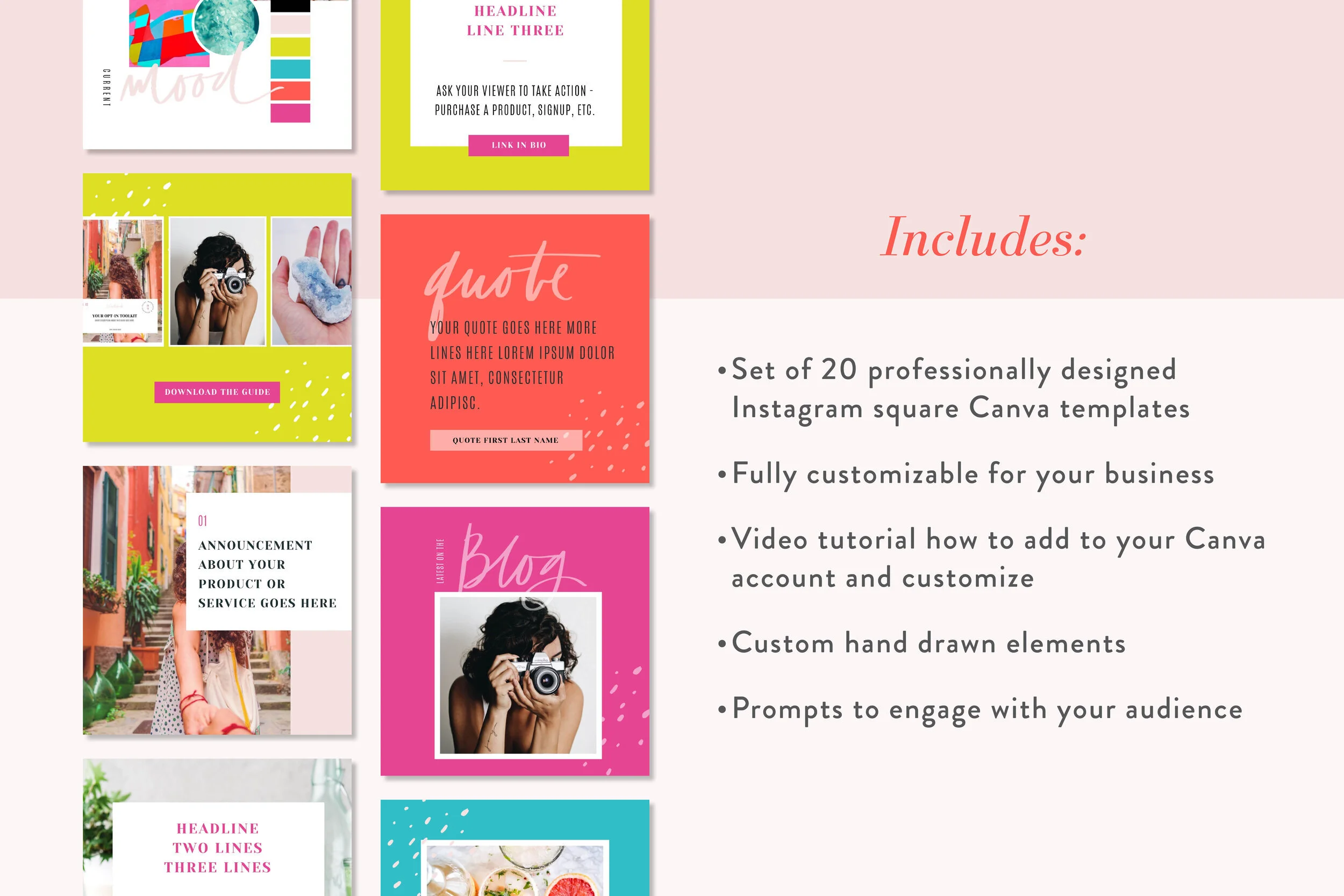
At The Shop, we’ve already made square templates just for you that can be easily customized in Canva and used on Instagram (or even Facebook).
Each bundle comes with 20 different square templates. All you have to do is switch up the colors and fonts– or leave them as is– and that’s it. You can reuse them for different quotes, announcements, showcase your own pictures, or whatever you wish to do with them. Each one is professionally designed, and all elements are 100% customizable. We even provide you with a video tutorial showing you how-to in case you aren’t familiar with Canva.
They come in three color collections, soft, neutral, and bright, and can be picked up for just $27 at The Shop. If you get there and love you see, feel free to join our membership for only $47 per month and get unlimited downloads of all the templates, plus the new collections we release each month. We’ll even give you 10% off all Merch, so you can rock being a boss in style.
Once you download your templates, show us your customized creations by tagging us over on Instagram @bossproject, or come post them in our weekly Shop Show-off thread in our Facebook community.
If you tag us on Instagram, you can bet your top dollar that we’re going to come make sure you didn’t pass any of these steps. We’re always watching!


