Here's Why You Should be Using Header Graphics in Your Emails
So, you either already have an email list or you’re wanting to start one. You’re putting together all of the awesome, value-packed emails, your new announcements, simple chatty messages, and you’re done, right?
Wrong.
Out of all of the important factors that go into an email, one thing we highly highly recommend you don’t forget is your header. This is the eye-catching graphic at the top of an email. They can serve different purposes, but the main point is that 1. They help your email stand out, and 2. They have the ability to give your reader a quick idea of what your email is going to be about.
We’re positive that in all of the newsletters you receive in your inbox on the daily, 100% of them probably have some sort of opening header graphic. This is their staple. This is the one thing you can expect to see every time when you open their email.
Today, we want to help you figure out why you need your staple and what it can do for your emails.
(Psst. We even have a special surprise for you at the end so you can make your email headers amazing!)
Why Do You Need a Header?
They set the tone for your emails. Your subscribers get an idea of your brand identity, whether it’s bright and bubbly or more muted and professional. When they open the email, they’ll also know exactly who it came from even without having to look at the “From:” field. Having that beautiful graphic will also entice your reader to keep scrolling and read the contents of your email.
Including an email header is a simple simple way for your biz emails to go from “meh” to “wow”. Plus, they provide an easy way for your readers to quickly recognize amazing content from you and, babe, brand recognition is priceless. Even if yours doesn’t include all of the bells and whistles, like drop-down menus, having that image will help them realize that this is a business they’re dealing with, and one that just happens to be awesome at what they (you!) do.
Keep It Simple
You don’t need an extravagant image, just something to establish your brand identity and even give them an idea of what the email is about at a glance.if you so choose. Remember the “Some images have been blocked for your security” sentence at the top of emails? Some readers choose not to load images at all, so you don’t want to put all of the important info in your header. They should just serve as a “Hey! Here I am showing up consistently to give you some great stuff!”
Your readers shouldn’t have to spend more than a minute looking at your header. Filling it with too much text or images will keep it from being understood immediately, especially from your readers who may be viewing on-the-go from their mobile phones. In that case, your header has just decreased in size significantly, so you want it to still be readable and pass the “squint test” (meaning they shouldn’t have to squint to try and read what it says).
ADD PHOTOS IF YOU WANT TO
Adding some kind of photograph or imagery in there can be eye-catching, but just like the overall header, the image should be simple and versatile. If you include a number of images in your email, consider if the header’s image will work alongside it or clash.
Consistency is Key
It’s okay to have different headers for different email subjects, but try to keep the general style and primary elements consistent. Maybe keep the logo in the same position, but change up the colors and, if you use one, the image. Or, at the very least, they should all look like they’ve been designed by the same person. Throwing off the “look” of the header can confuse your readers, which defeats the purpose of it solely being something they can identify your brand from.
Put together a few different versions of headers that you can cycle through for the appropriate subjects. Having multiple styles helps to keep your emails interesting and dynamic, but keeping them consistent in design allows them to still be recognizable.
We’ve Done Most of the Work For You
Remember that special surprise we were talking about in the beginning? This is it.
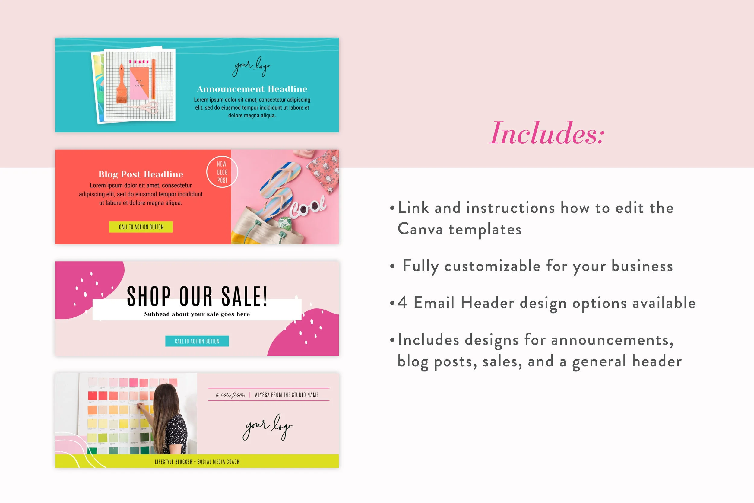
All new in The Shop, we have email header templates! They come in three different color variations– soft, neutral, and bright– and each has four styles of headers, which are general announcements, new blog posts, shop announcements, and a personal note. Bonus: they’re super easy to customize using Canva so if you want to add your own pizazz you can do that too! However, although they come like this, you’re completely allowed to customize every part of them in Canva, so you don’t have to stick to these four themes.
Oh, but we aren’t finished yet. If just having templates isn’t enough for you, we also have a template bundle that includes our mini-course, Email Like a Boss, which will teach you all about how to conquer email marketing and start making conversions.
The one-off price for just the templates is $, and you can snag the bundle for $97. If we were you, though, we’d go ahead and look into our membership for only $47 a month and save that other $50. Then, you could download not only our email header templates but all of the templates in The Shop, including our current and future new releases! It’s a win-win.
Once you download and get to using our templates, share with us over on Instagram or inside our private Facebook Community. We can’t wait to see your amazing headers!


