Dubsado vs. HoneyBook Feature and Interface Comparison
There are two top dogs in the CRM game right and now, and they’re crushing it: Dubsado and HoneyBook. About half of the service providers you talk to will be Team Dubsado, while the other half are Team HoneyBook.
No matter which team you choose, though, having a CRM is a massively important piece of running a service-based business. You need some type of system to help you streamline your processes, leads, client communication, and more, and either of these platforms will help you do so.
So, which team are we? Today we’re going to dive into comparing Dubsado vs. HoneyBook’s features and interface. For us and many others we know, these are the two main deal breakers when it comes to choosing any sort of software, not just CRMs. Keep reading if you want to find out who comes out on top!
Dubsado vs. HoneyBook Features & Interface
Let’s just start off by saying that Dubsado and HoneyBook’s features are scarily similar. Both platforms have:
Project statuses
Form templates
Workflows
Calendar with the ability to integrate with Google Calendar
Scheduling
Tasks
Time tracker
Simple bookkeeping tools
Canned emails
Client portal
Custom domain URL
3-step proposal/contract/invoice sending
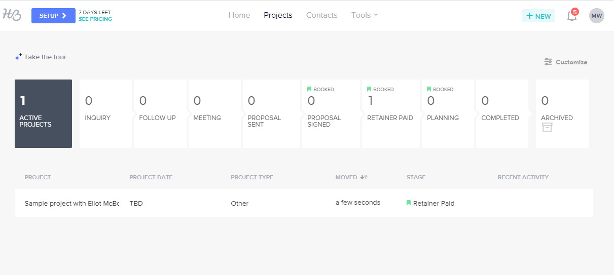
As far as the interface goes, they’re both unique in their own ways. Dubsado’s bold colors can be helpful for visual learners, while HoneyBook is a bit more muted. However, they’re both just as easy to navigate.
They do still have their differences, though, and here are just a few we noticed right off the bat:
FORMS
Dubsado has a drag-and-drop builder that you can use in all of your forms to add images, text, questions, dropdown menus, a file uploader, code blocks, and more. This allows you to make your forms really branded and, well, pretty.
The length of HoneyBook’s form customization depends on the type of form you’re creating. With proposals, you’re only able to customize the proposal cover photo, line items included in their package, the invoice payment schedule, and the contract. They also have a template for what they call “brochures”, which are the most versatile and customizable form option. With these, you’re able to basically build whatever type of document/form you want. However, your section options are limited to text, images, and questions.
PROJECTS
This is one of the most distinct differences between Dubsado and HoneyBook in our opinion. In HoneyBook, there’s an Activity tab that acts sort of like a newsfeed in a way that shares activity between you and the client. It shows emails that you’ve sent and that the client has sent, as well as when a form was sent, invoice was paid, contract was signed, etc.
In Dubsado, you’re able to see all email threads and send/receive them, then in a separate “Forms” tab you can view all forms and when they were sent. HoneyBook also has this option, but we really like that news feed-like feel of the Projects page.
TASKS
Both Dubsado and HoneyBook have a page to view and create tasks, but we really enjoy Dubsado’s task boards capability. You’re also able to share tasks with your clients in Dubsado so that they can either just view the progress of a project from their portal whenever they please, or you can assign tasks to them to complete.
CLIENT PORTAL
Both of their client portals have very similar features and capabilities, the two main differences being that clients can upload files directly inside their client portal, and they can also respond to messages. Although clients in Dubsado can view files in their portal, they can’t upload. They can also view emails between the two of you, but they can’t send any from their portal.
You do have more customization options for the client portal in Dubsado, though. You’re able to display or hide your logo, add a mobile and desktop banner image, display or hide a custom welcome message. If you don’t want to upload a banner image, you’re also able to change and edit it to a solid color, and change your tab colors. Dubsado also provides code for you to embed the portal on a page of your website.
Here’s Dubsado’s client portal:
And HoneyBook’s:
And the Winner is…
Of course with a comparison, there has to be a winner. We’ll admit, this was heckin’ close. There are admirable qualities of both platforms, and we almost wish there was a new CRM that gave you the best of both worlds. Unfortunately, that isn’t the case, so we have to claim Dubsado as the winner here!
If you’re wanting to see what all the hype is about, just head here to learn even more about Dubsado, sign up for a free account, and then save 30% on your first month or first year when it’s time to upgrade! Dubsado gives you a 3-client free trial that only expires when you use up your client limit, so you have plenty of time to dive in and give it a test run.


